
For some time already, I had been thinking about adding a static homepage to this website. In which case, a magazine like front page would be the most obvious choice, since Wilwebs.com is a blog.
The post about the Dynamik Skins was an excellent opportunity to try the BlogPress skin. Generally, all Dynamik skins offer a pre-customized layout and styling. And BlogPress offers a head start with regard to the development of online magazines.
Wilwebs.com focuses on three categories of WordPress products: Frameworks, Plugins, and Themes, or rather child themes and skins to the frameworks covered. One of my requirements is that the homepage should convey the focus on these categories.
In this post, I am going to share the process that led to the new design. A process that highlights one of the biggest benefits of the Dynamik Website Builder – you can add, and reorder widgets areas on the fly without coding. This makes prototyping with Genesis and Dynamik easy and fun.
Structuring the Homepage
Although the homepage above is not based on the BlogPress skin, it is definitely inspired by BlogPress.
This homepage is assembled from:
- EZ Feature Top Wide Left 2 – latest blog post, subscription box and social icon
- EZ Home 3 – posts in the categories Frameworks, Plugins and Themes
- EZ Fat Footer 3 – an about me section, latest posts and latest comments
My problem with this homepage layout, is that the post in the Top Wide Left draws most of the attention. Because of this, the latest category posts do not get the attention they deserve.

So, I decided to leave replace the EZ Feature Top Wide Left 2 area with the EZ Feature Top 1 area to display the tagline.
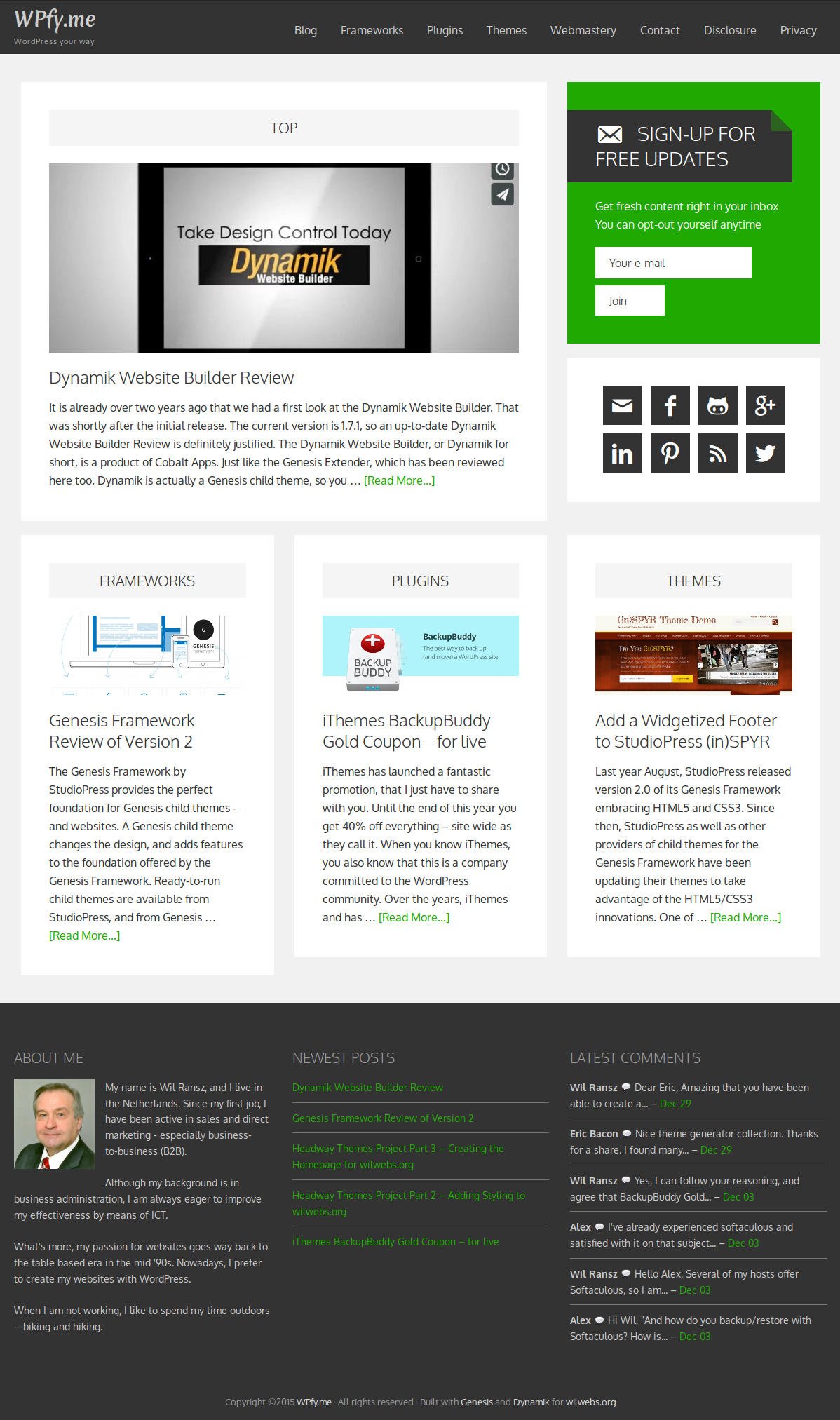
In addition, I created a widget a Dynamik Hook After EZ Home widget area at the bottom for the subscription box.
Yes, the box at the bottom is quite big. That is why, in another attempt, I shrunk the subscription box to two third, and put the social icons at the right hand side of it.
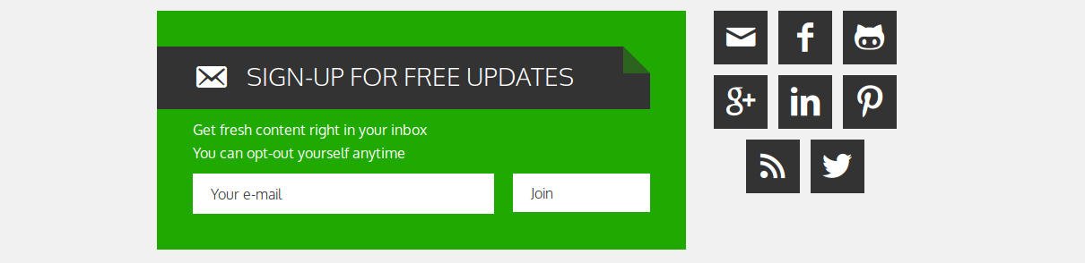
That made a cluttered impression, and was not really an improvement.
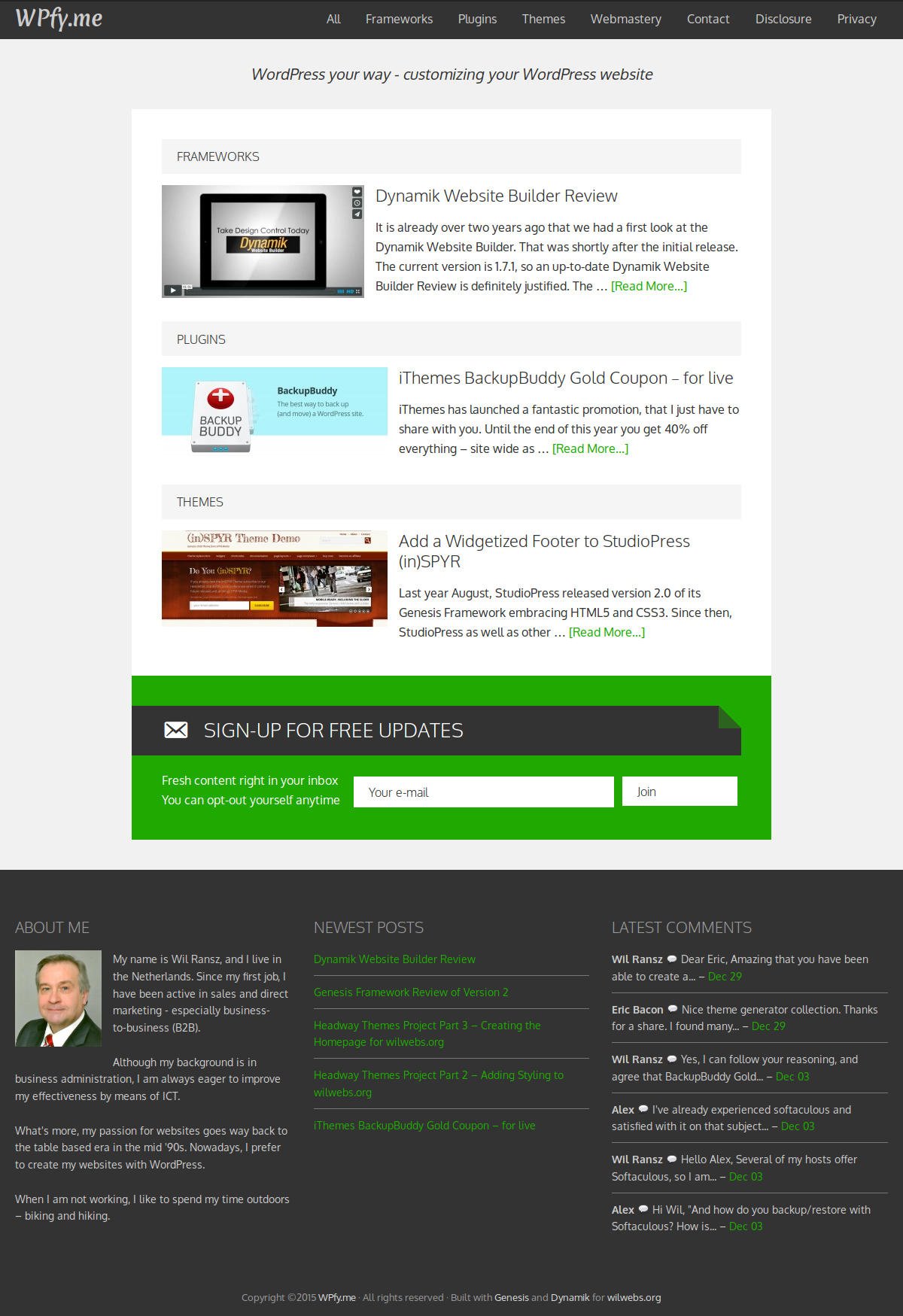
In the screen capture above, you will notice that latest posts from the three categories have been stacked on top of the subscription box.
The width of the homepage content area is two third of the width of the website. This layout works pretty good with mobile devices.
In first instance, I was charmed by this layout. However, I got doubts afterwards, and kept having mixed feelings.
At that point, I decided to keep the blogfeed on the homepage.
Creating the Styling
But I still wanted to replace the existing green/black styling with a more contemporary one.
The existing styling, introduced in May 2012, was based on #20A901 green and #333 black.
My first step to a new color scheme was to pick a new main accent color – the color you use for (unvisited) links.
And since flat is still trending, why not a nice flat green? As you probably know, a flat color is a color without depth. Without texture, shadows, and gradients.
My main resources for picking flat colors are flatuicolors and flatuicolorpicker. The latter lists considerable more variants in the flat color spectrum.
Where Flatuitcolors has only four, Flatuicolorpicker displays 25 greens.

Unfortunately, we can not consider all 25 shades of green. We do not want our visitors to strain their eyes, so bright greens are not a good choice on a white or bright backgrounds.
My third attempt, after the Caribbean Green and Silver Tree, was Mountain Meadow. We had a hit. The hex color code regarding is #1BBC9B, and in RGB format 27, 188, 155 (RGBA 27, 188, 155, 1).
When the first color is set, we continued for the secondary color. Pairing colors can be tricky, especially when you need more than two.
Fortunately, there are several tools for selecting matching colors. I often turn to Paletton (formerly colorschemedesigner.com) and Adobe Color wheel. Both websites allow you to choose from several color combinations like Complementary, Triad, and Compound.
Usually, I start with Paletton, and when I am not happy with the suggestions over there, I try Kuler. You do not have to follow their advise blindly, but both sites provide balanced suggestions.

When I checked the compound combinations at Kuler, I immediately liked the dark blue #2F4956 or RGB 47, 73, 86 (RGBA 47, 73, 86, 1). This blue is dubbed as Dark Cornflower Blue. I can literally see the cornflowers waving near the mountain meadow.
There is only one way to find discover whether the color combinations really works out. That is applying the colors in your design.
 Well here it is. That does not look bad when you ask me. What do you think?
Prototyping
This prototyping exercise has taught me two things about the Dynamik Website Builder.
One, adding, removing, and reordering widget areas is a breeze with the Genesis/Dynamik combo. No need to code, just point-and-click.
Second, Dynamik has proven to be a very mature and stable tool. During this project, I have tried at least a dozen combinations of widget areas. I have exported skins, some of which were later re-imported and adjusted. It all worked like flawless.
So, when you start a WordPress project without a clear blueprint and need to prototype, you should definitely consider the Dynamik Website Builder with Genesis.
Leave a Reply