In this article, I zoom in on the capabilities of the Divi Builder, the visual page builder incorporated in the Divi Theme. These two are so close, they share a product page.
As said, the Divi Builder is a visual page builder and an integral part of the Dive theme. However, the Divi Builder is a plug-in that works with any theme.
To launch the Divi Builder, click the [Use Page Builder] button from the Add New Page or Add New Project screen. When the Divi Builder launches, the text of the button changes into [Use Default Editor].
The initial Divi Page Builder screen displays three buttons:
- Load Layout – lets you choose from 16 pre-made layouts
- Save Layout – add your work to the library of loadable layouts
- Clear Layout – deletes your work in progress
Let us first have a look at the 16 pre-made page layouts you can choose from:


These pre-made layouts give you a superb head start no matter what kind of website you have in mind. Of course, you can apply a pre-made layout as it is. You can also decide to use a pre-made layout as a template, and adapt it to your needs.
Custom Page Layouts – with Ease
To discover the real power of the Divi Builder, you have to take the third route: create your own custom page layout. Your first step on this journey, is adjusting the layout presented to you by Divi’s initial screen.
It is important to understand that Divi distinguishes several levels of building blocks:
- Section – sections are the main components of a web page
- Row – every section can have as many rows as you like
- Column – each row can have one to four columns
- Module – the content container, basically you add a module to any column
Sections
Basically, you can create a web page with only one section. However, by putting – let us – say a slider, blog posts, and your projects in different sections, you get the opportunity to style these sections differently. For example, by assigning each section a different background color or another background image.
Every section gives you the opportunity to assign a CSS ID and a CSS class. These cascading style sheet selectors, allow to to add custom styling for the section concerned.
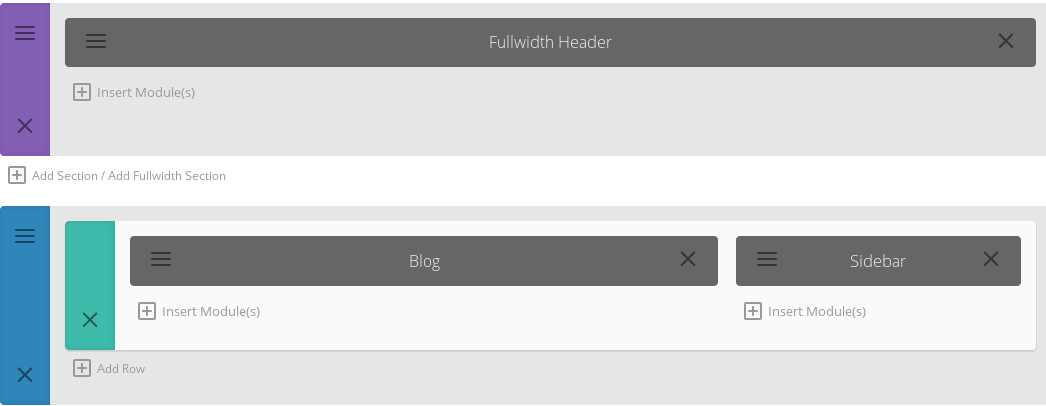
How do you add another section? Simply click the Add Section link like in the image above.
Rows
Increasing the number of rows is just as simple; just click the Add Rob link. How many rows are feasible is completely up to you.
A business website might want to list only one row with features on the homepage, while a webdesign agency might want to add two rows to showcase their most recent or greatest projects. An online magazine site on the other hand, might want to dedicate entire rows to each of their main news categories, and two or more for the other news. When it comes to Divi you are only limited by your imagination.
Columns
As you can see in the picture above, you can choose from one up to four columns. You can spread these columns equally over the available width of the row, or have columns in varying sizes.
Modules
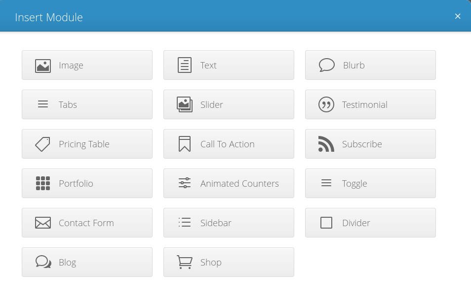
Depending the type of content you want to include, you pick a specific module. You have 17 options:
- Image
- Text
- Blurb
- Tabs
- Slider
- Testimonial
- Pricing Table
- Call To Action
- Subscribe
- Portfolio
- Animated Counters
- Toggle
- Contact Form
- Sidebar
- Divider
- Blog
- Shop
The Image Module allows you to upload an image, ad a URL, and set the desired type of lazy-loading animation.
The Text Module presents to you the full featured visual editor as well as the HTML editor.
The Blurb Module extends the features of the Text Module, in that you can add an image, a title, and a URL. In addition, you can also choose the alignment of your text; left, center or right.
With the Tabs Module, you can create several texts will can be displayed when the appropriate tab is clicked.
The Slider lets you upload as many images as you want. Next to uploading an image for each slide, you get the opportunity to add a heading, a button text and URL, a background color and/or image. Regarding the Slider, you can choose to show or hide the navigation arrows as well as the slider controls. Besides setting automatic animation and animation speed, you can even enable a parallax effect.
Testimonials are composed like texts. In addition, you can add an author name and the author’s site URL.
With the Pricing Table Module, it has become very easy to create table columns.For every columns you can enter a title, subtitle, the currency, unit, and price, as well as a button URL and text. Next you add a features list with the editor. You can even mark one column as featured so that it will stand out from the other columns..
When you want to add a Call To Action banner, you enter a title, a button URL and text, set the background color and orientation. You can even add more content with the editor.
The Subscribe Module lets you easily create a subscription form for mailing lists facilitated by MailChimp. You enter a title, the button text, set the background color and select a mailing list. In case you prefer to add more text, you can use the editor.
Your first option with the Portfolio Module is choose between a full width or grid styled portfolio layout. Next you can set the number of project entries to display, select the preferred categories, and pagination.
The Animated Counters let create and display progression bars.
With the Toggle Module it becomes very easy to create toggle-able lists, like a FAQ list. You can enter a title, set the state (open or closed) and create a text with the editor.
Regarding the Contact Form Module, you can choose between a form with or without captcha.
Selecting the Sidebar Module lets you import one of the widget areas – either a default one, or one that you have created yourself.
The Divider Module lets you add padding, white space, by entering the desired color and height in pixels.
With the Blog Module, you can import any number of blog posts from selected categories – with or without the Featured Image.
The Shop Module requires the WooCommerce plugin. By applying this module, you can include Recent Products, Featured Products, Sale Products, Best Selling Products, Top Rated products. You can enter any number of products you like and choose up to four columns.
Each module gives you the opportunity to change the Admin Label, and assign a CSS ID and/or a CSS class. The latter allow you to address the module with custom styling – just as with the Sections.
The Admin Label is the name of the module visible while working with the Divi Builder. When you do not alter this label into something more meaningful, it will simply show the default name of the module. So for example ‘Blurb’ instead of ‘WPReviewLab’ (WPReviewLab was a WP Theming website of wilwebs.com).
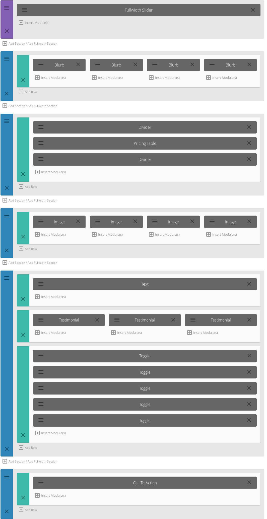
While playing around with the Divi Builder, I have composed a simple business page with four sections:
- Slider
- Blurbs
- Projects
- Call to Action
Here you can see how this page looks at the WordPress back-end, and how the result shines on the front-end.


Transferring Your Custom Layouts
ElegantThemes Divi comes with an export facility to export and even transfer your custom page layouts to other Divi installations.
From the WordPress backend, go to the Appearance module and choose Export Page Builder Layouts – just above the Divi Theme Options. That pages serves a blue [Download Export File] button. Hitting that button will export your custom layouts as an XML file.
In order to import this file at the receiving end you simply use the default WordPress import tools. In the WordPress sidebar, go to Tools >> Import and choose WordPress. Browse to your file and hit the [Upload file and import] button. Assign or when necessary create a new user and hit the [Submit] button.
That is it. Not only handy for transfers, but for backups too.
As mentioned, the ElegantThemes Divi Builder is integrated in the ElegantThemes Divi theme. When you buy one, you also get the other one.


